Enrapture your Audience with Well-Designed Poster Presentation
Introduction
Preparing and presenting research posters have been known to be a wonderful way to share your research work during conferences. Sharing research related posters during conferences with fellow researchers allows you to obtain prompt feedback with regards to your work. It also presents an excellent networking opportunity and facilitates you to build associations for collaborations with others in the future [1]. While there are several advantages in preparing and presenting a research poster, the very initial attempt to prepare and present a research poster could prove to be very challenging and also a formidable task. Very often, graduate students are on their own as far as figuring out how to prepare poster presentation, is concerned. As an outcome, they might end up creating posters that are replete with extensive data, including textual content and thus creating posters that might be difficult for the reader to follow.
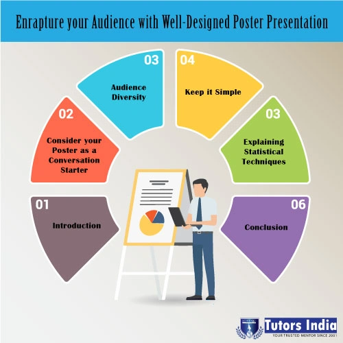
In order to ensure that you prepare and present well-designed research posters, particularly for UK universities, it would be beneficial to follow the steps for preparing poster presentation as outlined below.
Consider your Poster as a Conversation Starter
A research poster is not supposed to be an extensive report of what you have done in your research. The fundamental objective here would be to draw the attention of people who are attending the conference, which will enable you to start a conversation with them. Keeping that in mind, it would be of immense help to design your poster as an aesthetically appealing tool that would be instrumental in sharing your research work [2]. This can be utilised as an opportunity to gain inputs and feedback and to network with other participants of the conference. The way you present it will decide whether you will be able to find collaborators for your research.

Audience Diversity
The people or audience that you might meet at a professional conference might largely differ in terms of their methodological and substantive backgrounds. There could be people who are conversant with your topic but they might not have any idea about your methods and vice versa. Some audience might fall in the middle category with little knowledge about your methods and topic [3]. Further, developments in methods of research would mean that even researchers who have acquired top-level training in methodology a decade or two ago, might not be familiar with the latest in methodology. At the time of designing your poster, you need to offer ample background on topic as well as your methods which will be helpful in communicating the purpose, findings and the implications from your research to the target audience you intend to attract.
Tutors India offers academic and scientific poster presentation services, including designing and poster writing, to reflect your current academic requirement. Our academic writers have the capability to write and design a high impact poster design.
Keep it Simple
There is sense in simplicity. It would be worth writing in such a manner that your audience will grasp how your research might be significant to them. This will present them with a clear-cut message in the brief time they view your poster. It has been recommended by experts within the domain of poster design and communication that planning your poster around two to three key points will drive the message home [4]. Accordingly, you need to design your title charts and text to stress upon those points. Begin your poster by making the viewer familiar with the key research questions that you intend to highlight. Following which, you can provide a brief of your data and methods prior to presenting the evidence to answer such questions. Conclude by summarising your findings and its implications on research [4].
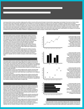
Figure 1: How your Poster should not be

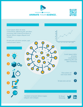
The above poster is too heavy on text. The audience might not have the time to read through the entire contents. Instead, the sample in figure 2 is how your poster is supposed to be. Some text interspersed with relevant figures and graphs.
Figure 2: How you Poster should be

Poster presentations need to be self-explanatory or theme based to relate to the research subject. This will enable users to follow the story you are trying to tell and analyse your adopted approach. Tutors India offers the best Poster presentation service in the UK.
Explaining Statistical Techniques
It has been suggested by Newsom et al., [5], that it would be beneficial if your descriptions pertaining to methods and data is succinct while ensuring that the information presented is adequate to convey the core message. This will enable users to follow the story you are trying to tell and analyse the approach you have adopted. As per poster presentation tips and guidelines, one rule of thumb is to refrain from cluttering it with far too many technical details or complicating key findings with unwanted jargons. For audience who are keen to learn about additional information pertaining to methodology, you can always provide ‘hand-outs’ which includes a citation to a relevant research paper [6]. While writing about statistical techniques, make sure you link it to particular concepts you have studied. Use synonyms for statistical and technical terms as much as possible. You need to keep in mind that several conferences are of interest to policy researchers, it might bring in people from diverse disciplines. Though you might have an elite white-collar audience, it is not necessary that they have a good knowledge about technical vocabulary used in other domains.
Conclusion
Needless to say, many academic researchers have no knowledge of how to prepare poster presentations. They require adequate poster presentation tips and guidelines that will help them to overcome the challenge they face in Research poster presentation help in UK. But you need not worry, you can obtain conference poster presentation help uk and help for scientific poster presentations by turning to professionals.
References
[1] E. Barker and V. Phillips, “Creating conference posters: Structure, form and content,” J. Perioper. Pract., vol. 31, no. 7–8, pp. 296–299, Jul. 2021, doi: 10.1177/1750458921996254.
[2] J. Berg and R. Hicks, “Successful design and delivery of a professional poster,” J. Am. Assoc. Nurse Pract., vol. 29, no. 8, pp. 461–469, Aug. 2017, doi: 10.1002/2327-6924.12478.
[3] A. Gopal, M. Redman, D. Cox, D. Foreman, E. Elsey, and S. Fleming, “Academic poster design at a national conference: a need for standardised guidance?,” Clin. Teach., vol. 14, no. 5, pp. 360–364, Oct. 2017, doi: 10.1111/tct.12584.
[4] B. Gundogan, K. Koshy, L. Kurar, and K. Whitehurst, “How to make an academic poster,” Ann. Med. Surg., vol. 11, pp. 69–71, Nov. 2016, doi: 10.1016/j.amsu.2016.09.001.
[5] L. C. Newsom, S. W. Miller, and M. Chesson, “Use of Digital vs Printed Posters for Teaching and Learning in Pharmacy Education,” Am. J. Pharm. Educ., vol. 85, no. 6, p. 8307, Jun. 2021, doi: 10.5688/ajpe8307.
[6] S. L. Siedlecki, “Original Research,” AJN, Am. J. Nurs., vol. 117, no. 3, pp. 48–54, Mar. 2017, doi: 10.1097/01.NAJ.0000513287.29624.7e.

 Previous Post
 Next Post